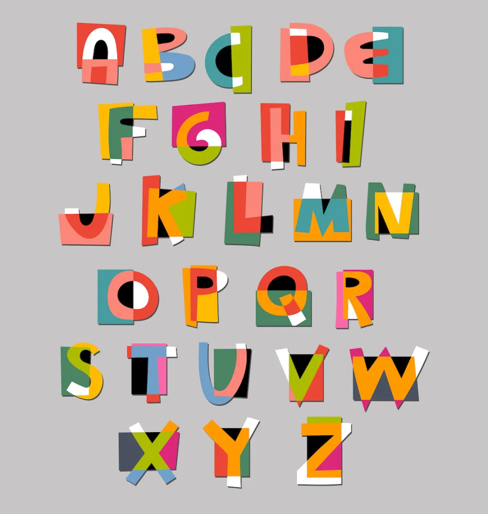
Typography is an essential aspect of branding. It is the art of arranging type to make written language legible, readable, and appealing when displayed. Typography can create a strong visual identity for a brand, convey its personality and values, and help it stand out in a crowded market. In this article, we’ll explore why choosing the right typeface is critical to the success of your brand and how you can make the right choice.
What is typography?
Typography is arranging type to make written language legible, readable, and appealing when displayed. Typography has been around for centuries and has played a crucial role in communication and design. Typography can make or break a brand’s visual identity, which can be the difference between success and failure.
The impact of typography in branding
Visual identity is a critical aspect of branding. It’s how a brand is visually represented through its logo, colour scheme, and typography. Typography plays a crucial role in creating a brand’s visual identity. It can convey a brand’s personality and values and help the brand stand out from its competitors. A brand’s typeface should be carefully chosen to match its personality and values.
The process of choosing the right typeface for your brand
Choosing the right typeface for your brand is a process that should be carefully considered. The first step is to understand your brand’s personality and values. Is your brand modern or traditional? Is it serious or playful? These questions will help you narrow down the appropriate typefaces for your brand.
Once you clearly understand your brand’s personality and values, you can start matching the typeface to them. For example, if your brand is modern and playful, you may want to choose a sans-serif typeface with rounded edges. If your brand is traditional and serious, you may want to choose a serif typeface with sharp edges.
Considerations for legibility and readability
Legibility and readability are essential considerations when choosing a typeface. Legibility refers to how easily a typeface can be read, while readability refers to how easy it is to read blocks of text. Legibility and readability are critical because they determine how effectively your brand’s message is communicated. When choosing a typeface, make sure it’s legible and readable, even at smaller sizes.
Common typography mistakes to avoid
Using too many typefaces is a common mistake that can make a brand look unprofessional and confusing. Limiting the number of typefaces you use to two or three is best. Another common mistake is using inappropriate typefaces. For example, using a script font for a serious brand can make it look unprofessional. Finally, ignoring legibility and readability is a mistake that can hurt your brand’s message. Always make sure your typeface is easy to read and legible.


